Zone (linear) Chart
Contents
What is a zone chart
A zone chart (Figure 1) is a visually more easily perceived line chart, it allows you to immediately see the highs and lows of the market, from which the price moves in the opposite direction – these areas are called zones. Traders rarely distinguish between a line chart and a zone chart and rarely use them for trading, because such charts are not informative enough.
A line chart can be called a time chart because it is based on time intervals. Trading platforms have the ability to change the time scale and the trader can see different stages of the trend development.
A line chart is a continuous line of points – prices, at a certain time. The most often chosen points are closing prices (close), opening prices (open) or the average between high and low on the selected timeframe.
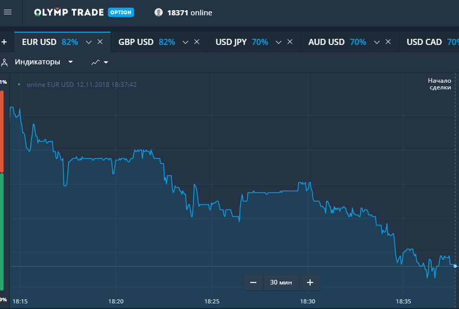
Fig. 1
What the zone chart shows
The line graph shows, in fact, only trend directionThe chart is the most common way to begin a trader’s acquaintance with a traded asset. The line chart is the most common way for a trader to get acquainted with a traded asset, because it allows you to quickly determine the dynamics of price movements and assume the prospects of the asset. Traders mainly use line charts for this purpose.
But on such charts you can also see the formation of typical chart patterns and trade on them. Since there is little information on a line chart, a pattern may look more distinct than on another chart, making it easier to determine if it is a valid or false pattern.
The zone chart is available on every trading floor and is the best way, compared to other types of charts, to show the highs and lows. The line chart shows data according to the moving average principle, it accurately displays the price of the asset at the moment.
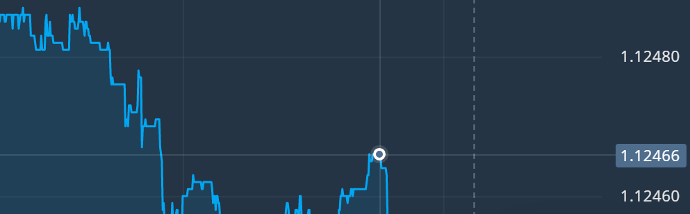
Fig. 2
Advantages and disadvantages of the zone chart
The information presented by the zone graph is intuitive on any length of time segment.
The advantages of a zone chart is the absence of redundant information, which allows you to more clearly determine the direction of the trend in a certain period of time, to recognize patterns. In addition, the line chart shows better Support and Resistance Levels.
The disadvantages of the line (zone) chart are also associated with a limited amount of information: they do not show the price gap, do not allow you to see the extremums in a certain time period, do not show the price changes of the asset within the time interval, on the daily timeframe you can see the overall trend for all time of its formation, but what was happening during each trading day, it is impossible to understand.
Therefore, the vast majority of traders use other charts in trading.
Zone Graph Analysis
Zone plot analysis is uncomplicated, but limited to a small number of parameters.
The chart allows you to study the dependence of transaction price on time. The chart displays data on each transaction with a specific asset, for which the price and time of the transaction are specified.
To analyze a line (zone) chart, the most interesting information is information about trades or quotes with the traded asset over a certain period of time – from a few minutes to a few years. Analysis of information on very short time intervals can be useful for trading, in conditions of the dominance of a well-defined trend.
But the analysis of both line and area charts is more useful for long time periods, especially if additional information is used for the analysis. This approach can provide much for understanding the market as a whole.
In a line chart analysis for trading purposes, conclusions are made based on the maximum price of the asset for a given period of time, the minimum price for the same period, the price of the first transaction at the beginning of the period in question, the price of the last transaction and the weighted average price by volume of transactions for the period.
The analysis of the considered charts shows the behavior of only one parameter in one period of time, it is not suitable for characterizing the market as a whole. Forecasting the behavior of a traded asset on such a chart is too superficial. The graph is more suitable for analysis of events that occurred in the past.
Zone chart in binary options trading
The zone chart can be used to binary options trading. In particular, trading by trend and by levels is practiced.
For trend trading it is necessary to determine the trend. To do this, first select the time of price changes display. Then the direction of the trend is marked on the selected interval of the zone chart, necessarily taking into account the corrective price movements. This is necessary for the most accurate determination of the time of entry into the market.
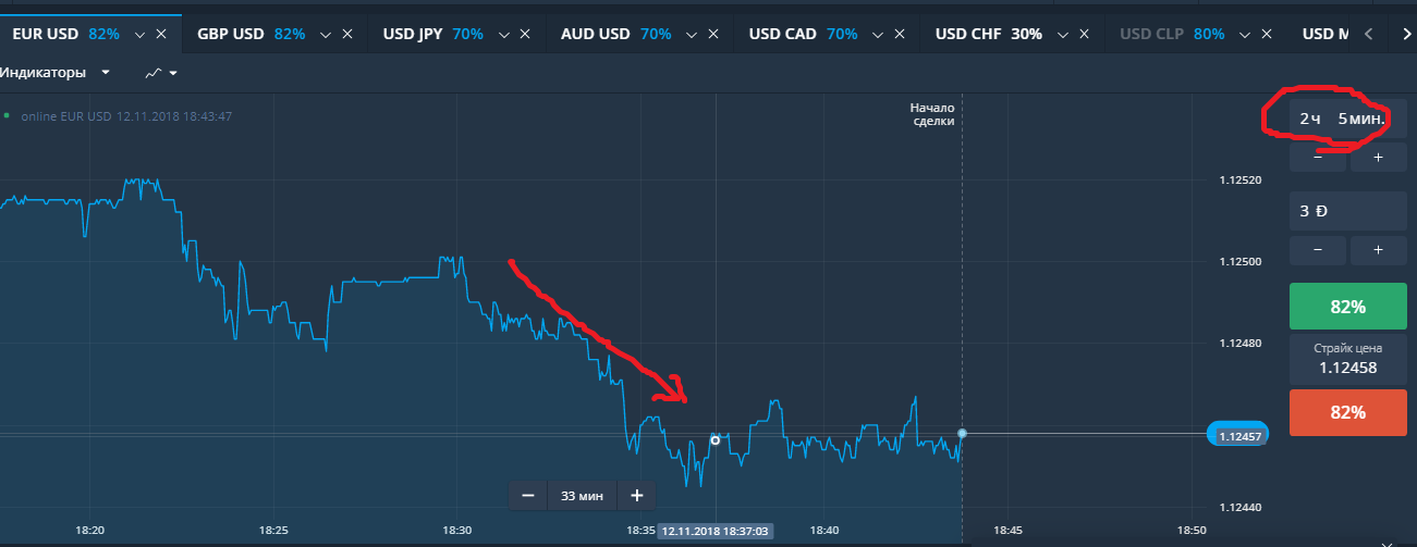
Fig. 3
Zone charts also trade by levels. At different periods of time, the price of an asset touches the same price value, that is, it reaches one level, then it corrects. On the chart, on the trading floor, the price level is highlighted by the horizontal linesThe price corridor is established in this way. Going beyond that level is often a breakdown, after which the price rushes upward. This is the opportunity that traders use.
On the zonal chart, traders can clearly see when the price reaches the highs and open a down trade, or the lows and open an up trade.
Log in to your binary broker’s terminal, study the available chart types and work with them:
| Broker | Bonuses | Open an account |
|---|---|---|
|
1
|
50 %
Bonus on deposit from $100 USD – promo code WELCOME50
|
Start |
|
2
|
5 %
Bonus when depositing via USDT (TRC20)
|
Start |
|
3
|
Cashback
Refunds of commissions, spreads and other costs
|
Start |
|
4
|
15 %
Bonus 15% on deposit by promo code iCGSbEgiAR
|
Start |
|
5
|
100 %
First deposit bonus
|
Start |
Zone chart in forex trading
The line graph begins with forex trading. The chart is used for the graphical method of forecasting, using it to identify patterns, clarify support and resistance levels. Patterns are standard not only in forex trading.
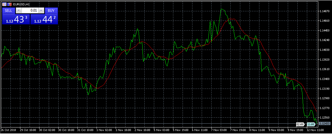
Fig. 4
Among such figures are, for example, “Head and shoulders”, “Double/Triple bottom”, “Flag” and “Pennant”. The graphical analysis pattern “Head and shoulders” and its inverted version can be called a classic one in technical analysis. This pattern signals the beginning of a trend reversal.
“Head and shoulders” are formed by three waves of price fluctuations. The top represents the maximum of the “waves”. The second maximum (head) is higher than the previous and subsequent wave tops. In a typical development, after the third maximum, the trend breaks the support level and the price rushes downward.
“Flag” is also a classical figure in the Forex market. It occurs under the following conditions: after a strong price movement there is a pause, which develops for some time as a flat – a sideways movement without strong fluctuations. This movement continues for quite a long time in a downtrend or uptrend and looks like a flag on the chart. The figure is considered one of the most reliable and allows you to confidently bet on an increase or decrease in price.
The “Double Bottom” pattern is also one of the noticeable patterns on the chart. It is formed on a downtrend – and represents two price lows, between which there is a small price rise,. After the second bottom, traders expect to see an increase in price.
Log in to the forex broker’s terminal, study the available chart types and work with them:
| Broker | Bonuses | Open an account |
|---|---|---|
|
1
|
50 %
Bonus on deposit from $100 USD – promo code WELCOME50
|
Start |
|
2
|
From 25 To 60 %
Deposit increase for the first deposit
|
Start |
|
3
|
Cashback
Refunds of commissions, spreads and other costs
|
Start |
|
4
|
100 USD
Loyalty program remuneration
|
Start |
|
5
|
20 %
Bonus and cashback by promo code revieweek23
|
Start |
Zone chart in cryptocurrency trading
At crypto exchange Linear or zone chart is rarely used in trading. The volatility and unpredictability of cryptocurrencies make this type of chart not very suitable for trading. Although it can be used in scalping on very short timeframes, because this strategy actually works “at random”, detailed analysis is not needed, which is good in this case, little-informative line chart.
But the zone chart information is enough to determine the general trend, especially on a long time interval.
A zone chart is also used when evaluating supply and demand. Cryptocurrency exchanges have a zone chart, the purpose of which is to show the ratio of sales and purchases of cryptocurrency. This version of the chart looks like downward waves from two sides, one showing the volume of sell orders and the other showing the volume of buy orders. This chart may well be used to predict price behavior.
If the supply and demand line are symmetrical, no rapid change in trend is expected; if the demand wave is steeper than the supply wave, it means that demand grows and there may be a rise in price. If the steeper line looks like a demand wave, we can expect a drop in price.
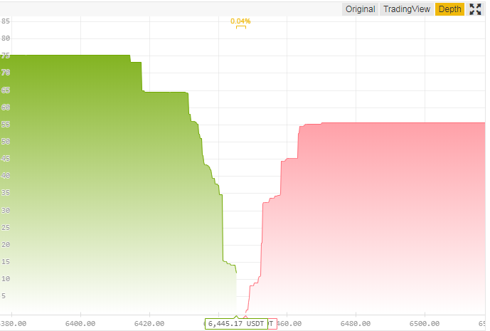
Fig. 5
Enter the terminal of the crypto exchange, study the available chart types and work with them
Example of a strategy on a zone chart
You can practice simple strategies on the line, zone chart, which are usually recommended for beginners. For example, Martingale strategy. The essence of the strategy is to double the bet after losing the previous bet.
To trade binary options, you need to register on one of the trading platforms, for example, Binomo (bonus 100% to deposit by promo code REVIEWEEK100 – Activate).
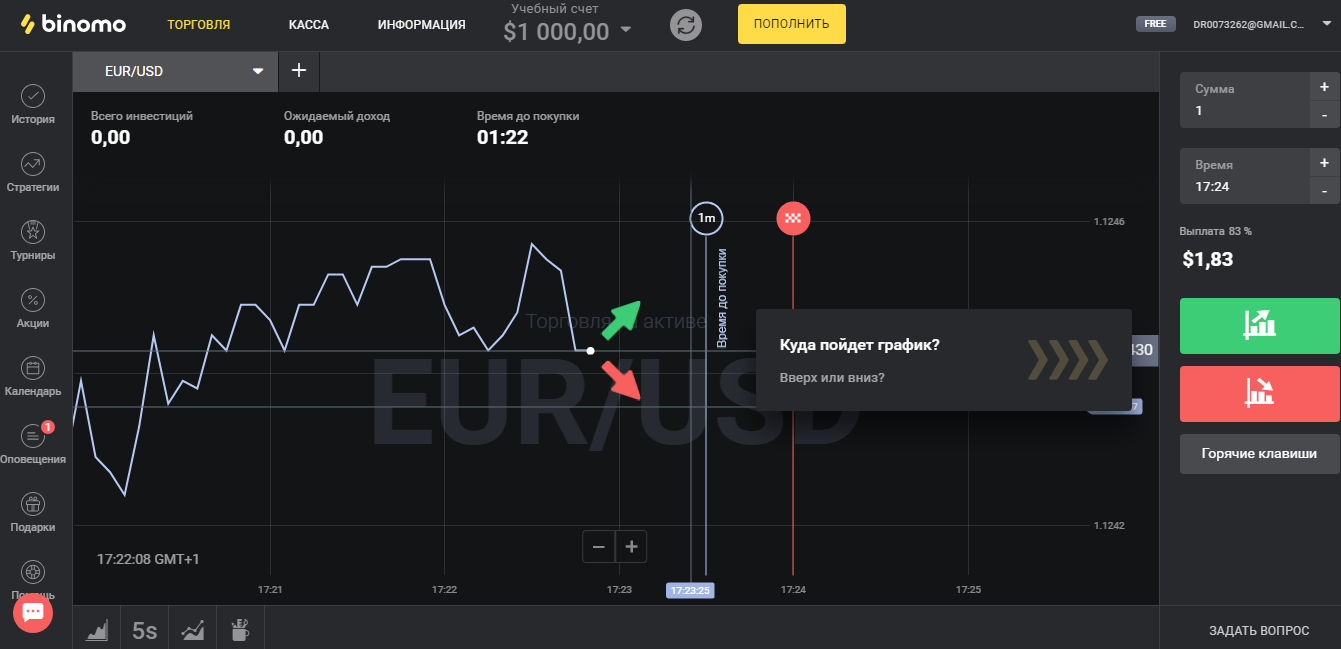
Fig. 6
Deposit money into the account, this can be done in different ways. And then go to the trading terminal. However, at first it is recommended to try demo accountwhich is provided on the platform. The amount in the demo account is indicated at the top in the center of the terminal.
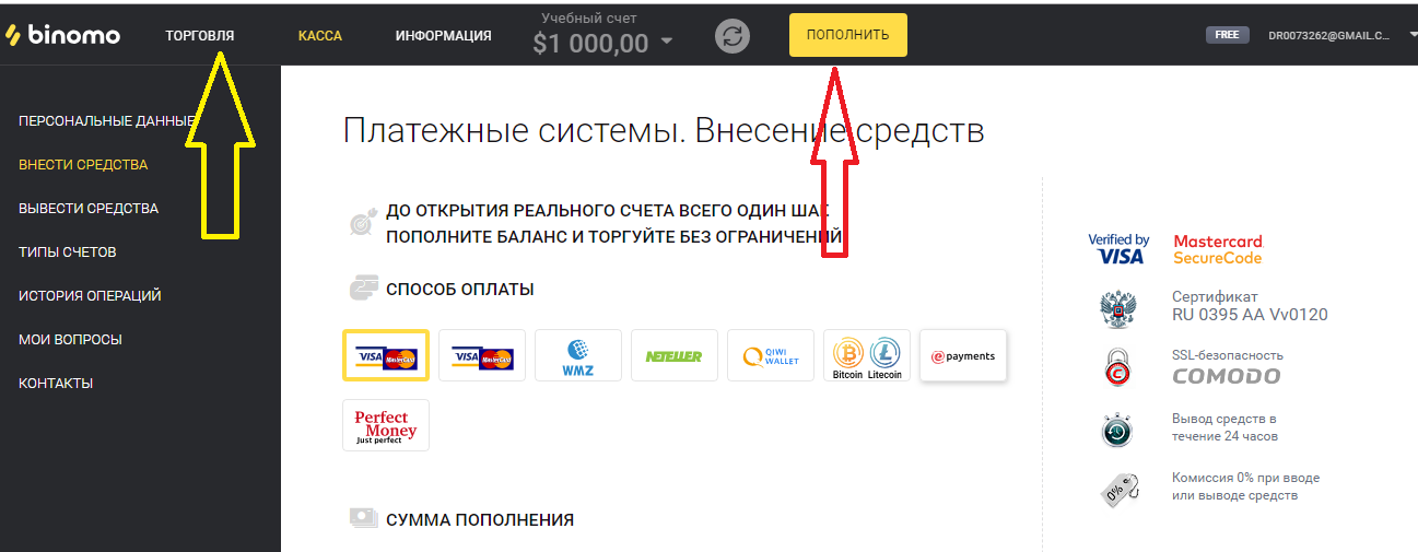
Fig. 7
At the bottom left of the terminal there is a button with a drop-down menu where you can select a chart.
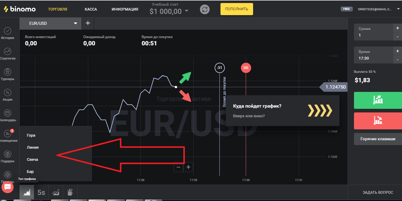
Fig. 8
After that, you need to select the time frame. In this case, the timeframe should be short, so that there was time to build up the bet. The button with the drop-down menu of time periods is located next to the choice of chart type. The Martingale strategy is short-term, so traders choose expiration time from 30 seconds to several minutes.
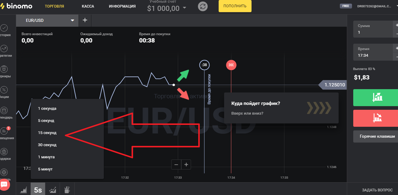
Fig. 9
Before you buy or sell, you need to make sure the trend is pronounced. Some traders recommend making sure the trend is pronounced for about 10 minutes.
Some time before the expiration of the time to sell or buy it is necessary to make a bet. If the trader loses, he doubles the amount of his next bet. Traders assume that, according to the theory of probability, each next bet can be more successful than the previous one.
The strategy works with greater efficiency, if the trader takes into account a number of points when using this strategy. For example, it is not recommended to panic at the slightest price movement not in the direction the trader expects. Increase the bet after the previous unsuccessful bet should be little more than exactly twice. You should not implement a strategy relying solely on luck, knowledge of the market reduces the number of erroneous actions and significantly increases the likelihood of a successful outcome.